Visualizing Smart House Sensor Data
Use Cases for visualising and analyzing our Smart House Sensor Data

In the last article, I covered how I measure and save power consumption and production in our Smart Home. However, the effort is only worthwhile if the recorded data is not only stored on a hard drive but is also used for visualization and analysis. The use cases for displaying and analyzing the recorded data of our Smart Home and the tools I use for this will be addressed in the following article:
Use Cases for Data Visualisation and Analysis
Numerous sensor data are required to implement classic comfort functions such as lighting and heating control in a Smart Home. Besides, the data from these sensors can be used to create extensive graphical displays and analyses.
The following use cases are just a few selected examples showing why I personally believe this is a very exciting topic:
Power Consumption and Production
In our passive house, electricity is our only source of energy. We use it to generate our hot water and heat our house. So it is exciting to know how our electricity usage is constituted. Our photovoltaic system provides us with additional data that can be put into an exciting context and then be visualized:
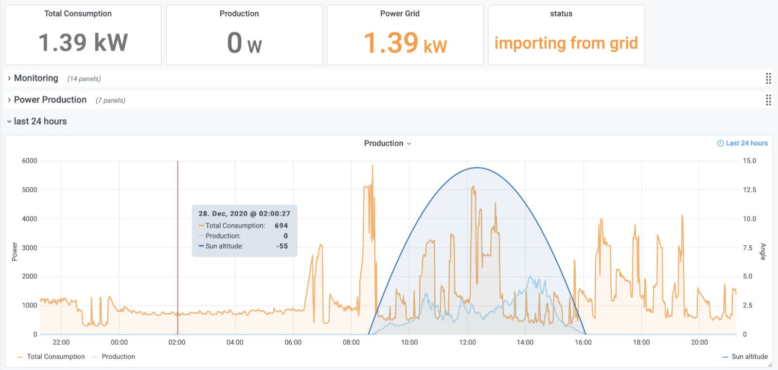
Visualizing Power Consumption and Production
In this picture the total consumption of our house is plotted together with the production of our photovoltaic system. Besides, the position of the sun is displayed and thus the period in which the photovoltaic system can produce electricity at all. Since the screenshot is from December, the electricity production unfortunately only covers a small portion of our consumption. Fortunately, this is significantly different in the summer months. But more about that in a separate article.
In the future, I would like to use the logged data of electricity consumption and production to answer more questions, such as:
- How can i optimize the self consumption of our produced energy?
- How does the power consuption splits in heating and household?
- Is our photovoltaic system aging?
Heating / Ventilation
With the ventilation system in our house, we not only supply the individual living rooms with fresh air, we also heat them. This creates a quite complex system with various sensor data that I extract from the ventilation system and store them in an Influx-DB database. For a well arranged presentation of the most important sensor data I have created the following visualization:
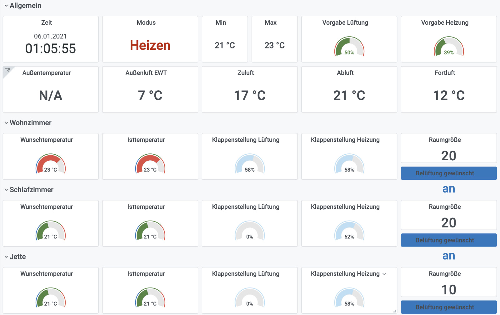
Visualizing our Ventilation System (labeling in german)
In this visualization, the most important data of the ventilation system (temperatures, fan speeds, etc.) and the individual living rooms (actual and target temperatures, flaps position, etc.) are displayed on a comprehensive overview.
Multi Smart House Analysis
The visualization of sensor data does not have to be limited to your own house. Together with two colleagues of mine, I have been collecting the most important data of our photovoltaic systems for some time.
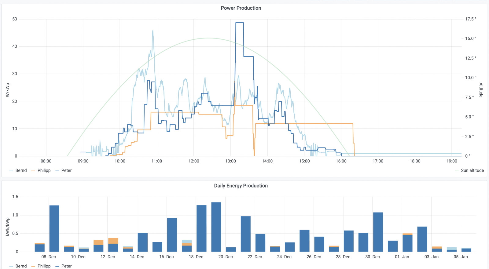
Visualizing multiple photovoltaic systems
The diagrams above allow us to compare the power production of our photovoltaic systems (normalized to the unit kWh/kWp), which has already led to some exciting battles on sunny days.
How I visualize my Sensor Data
Loxone
As the central control unit of our Smart Passive House, I rely on a Miniserver Go from Loxone. The system has convinced me in many self-performed comparisons with other (mostly open) Smart Home systems and includes some nice visualization features for sensor data:
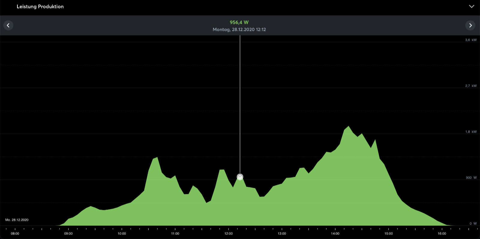
Visualizing sensor data with Loxone
The disadvantage of this solution is on the one hand the limited visualization options when it comes to displaying multiple sensor data at the same time. Besides, visualizations stress the built-in SD card of the Miniserver, which is why they should not be used too intensively.
Grafana
A much more powerful visualization than in the system of Loxone offers the open-source software Grafana. Grafana offers many possibilities of visualization with different graphs and works very well with the sensor database InfluxDB:
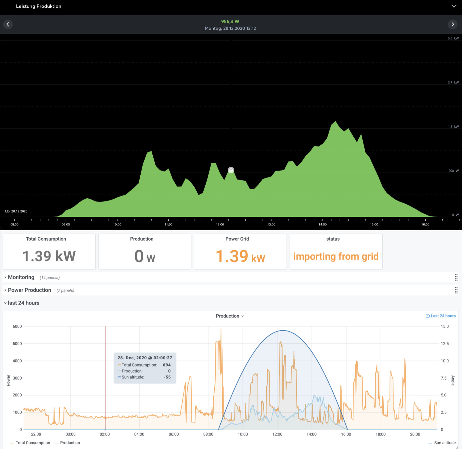
Sensor visualization - Loxone vs. Grafana
I created all the use cases presented above as examples with Grafana and always have a lot of fun creating dashboards in it.
Realization
A Raspberry PI is used for the realization of the visualizations with Grafana as described in the article about recording my sensor data. In addition to the tools needed so far (Node-RED and InfluxDB), we simply install Grafana.
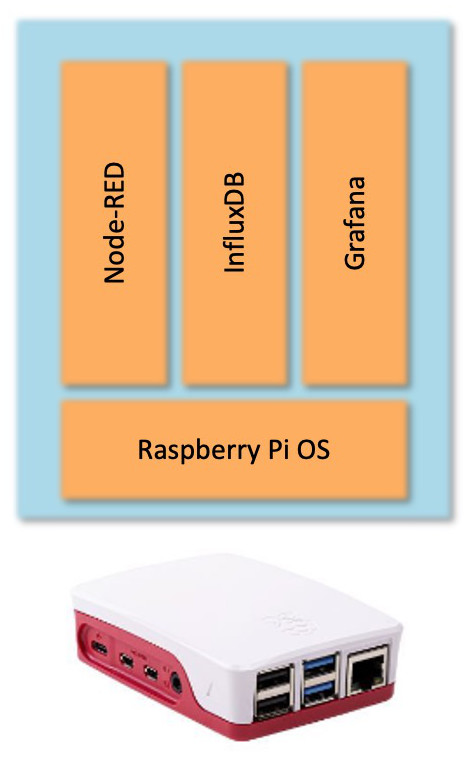
Raspberry Pi Software Architecture
Depending on whether the data should also be accessible outside your home network, port forwarding in the router is necessary (there are numerous tutorials out there).
Tutorials
If you feel like trying out Grafana with your own sensor data, there are several ways to dive into this topic:
An out-of-the-box solution for visualizing the data of your photovoltaic system is the project Solaranzeige.de. It is based on Grafana and already has preconfigured dashboards for your inverter that will get you there super fast.
If you want to visualize other sensor data or simply create a dashboard yourself, there is also a solution that will get you there quickly. On the Youtube channel of Andreas Spiess, a Raspberry Pi installation with various Docker containers is presented, with which you can set up an IoT ready Raspberry PI with Node-RED, InfluxDB and Grafana super fast.
Summary & Forecast
I have listed a few use cases for which it is worthwhile to create great visualizations from sensor data that is often overlooked. Neither complex hardware (a Raspberry Pi should be found in every smart house) nor expensive software licenses (all modules used are open source) are necessary. To get you started with measurement data visualization, I have selected two of the countless tutorials available on the web. Now I’m looking forward to your feedback. What is your favorite use case for the visualization of sensor data?